HTML names the parts. CSS decides how they look. JavaScript reacts when someone interacts. An API moves data between systems. Python automates and analyzes behind the scenes. GitHub stores the history, Vercel publishes the URL, Supabase remembers data between visits.
That is the entire mental model. Every tool on this site is one of those jobs wearing a different name. When something breaks, ask which layer owns the problem: structure, style, behavior, data, or deployment.
One complete project
HTMLNames the parts: headings, buttons, forms, the map container.
CSSLayout, color, spacing, states. People read layout before text.
JavaScriptListens for events, manages state, updates the page in place.
APIThe request/response contract between your page and any other system.
PythonScripts, notebooks, GIS analysis, data cleanup, backend logic.
GitHub + Vercel + SupabaseHistory, public URL, and memory between visits.
<button>Show open shelters</button>      <!-- HTML: the part exists -->
button { background: crimson; }          /* CSS: it looks pressable */
button.addEventListener("click", load);  // JS: something happens
fetch("https://api.weather.gov/alerts")  // API: data arrives
Skip ahead: the rest of this tab is not prose. It is working tools. Section 1 runs live SQL against a real Red Cross Parquet file in this page. Section 4 is a searchable browser of all 1,497 Calcite icons. Start there.
1. Live: SQL on Red Cross data
Parquet is useful only if it disappears behind a better Red Cross question.
Esri's June 2026 ArcGIS Online update introduced Parquet feature layers in beta. The idea is simple: keep large, read-only spatial data in a columnar format so web maps can draw and filter it faster.
That does not automatically make it useful day to day. The useful version is a tool that answers questions like where do risk, hardship, population, and Red Cross operating geography overlap? Parquet is just the fast read path underneath.
Not useful enoughHand-building beta Parquet layers
If the workflow is manually managing a new beta layer type, it will not beat normal ArcGIS layers, CSV mirrors, FeatureServers, or existing app patterns yet.
Useful as plumbingFast governed reads
Parquet helps when the data is big, read-only, refreshed from a trusted source, and queried by apps, notebooks, DuckDB, or agents.
Actually usefulRisk + hardship radar
The daily-use surface should be a plain question tool over Red Cross data. The user should not need to know Parquet is involved.
The live demo below uses Red Cross canonical data from data.jbf.com. DuckDB-WASM runs SQL against the public county Parquet file inside this browser page. No iframe, no server-side database, no staged screenshot.
SourceRed Cross dataCounty, chapter, region, state, ZCTA, tract, and division master exports.EngineDuckDBSQL reads Parquet directly without a separate database import.Map layerArcGIS JSResults become client-side graphics, not a hosted FeatureServer replacement.Best fitRead-onlyReference and analytics data that changes on a governed refresh cycle.
BeginnerCSV reads rows. Parquet reads columns.
If you only need a few fields, a Parquet reader can avoid hauling every column through the query.
IntermediateGeoParquet adds spatial metadata.
Geometry, coordinate system, extent, and type metadata make the columnar file usable in GIS workflows.
Why it mattersReference data gets lighter.
Canonical Red Cross geography can support notebooks, dashboards, agents, and map demos without creating another source of truth.
The buttons change the SQL, DuckDB reads county_master.parquet from the public data site, and the table redraws from the returned Arrow result.
Not run yet
SQL sent to DuckDB-WASM
Loading query...
What this provesWaiting for a live query.
Click Run query to load the browser database engine, register the public Parquet file, and rank real Red Cross county data.
Query result
Results will render here.
Honest answer: do not sell this as a new everyday ArcGIS workflow yet. Sell it as proof that a governed Red Cross data spine can power fast question-answering tools without creating another source of truth.
2. Data to wow people
The spectacular demo is not "look, a file." It is "show me where risk and need collide."
The public-safe Red Cross data spine already has enough to tell a strong operational story: geography, chapter hierarchy, population, household hardship, social vulnerability, natural hazard risk, FEMA disaster history, and ZIP/tract lookup context.
That means the peer demo should ask a human question first, then reveal that Parquet makes the answer fast and portable.
Rows121,992Across census tract, ZCTA, county, state, chapter, region, and division grains.Fields267Governed public-safe fields available through the data platform catalog.Sources17Census, ACS 2024, ALICE, CDC SVI, FEMA NRI, FEMA declarations, and Red Cross hierarchy.Best storyRisk radarRank places by hazard risk, household hardship, population, and Red Cross chapter/region.
StrongestRisk + hardship radar
Rank counties or chapters where hurricane, wildfire, flood risk, ALICE hardship, and population stack up.
UsefulChapter briefing generator
Pick any chapter and summarize counties, population, hardship, NRI hazards, SVI, and FEMA declarations from one governed row set.
Technical flexZIP to Red Cross lookup
Show a ZIP/ZCTA resolving to county, chapter, region, division, ACS 2024 indicators, and ALICE status.
Spectacular query recipe
PopulationHow many people sit inside the geography?
ALICE hardshipHow many households are below the survival threshold?
NRI hazardsHurricane, wildfire, inland flooding, tornado, heat, winter weather, and more.
FEMA historyHow often has the county appeared in disaster declarations?
Red Cross hierarchyWhich chapter, region, and division owns the operating context?
Parquet + DuckDBRun the query directly against the governed file and map the answer.
Example query result
Miami-Dade, Harris, Broward, Palm Beach, Hillsborough, Orange, Lee, Hidalgo, Bexar, and Polk rise to the top when population, ALICE hardship, hurricane/wildfire/flood risk, and FEMA declaration context are combined.
Why peers will care
It turns a raw geography database into a decision-support question: where should readiness, staffing, messaging, or chapter briefings get attention first?
What not to oversell
This is a public-safe reference demo. It does not include live shelter status, person-level data, donor records, private AGOL layers, or source-family fields that have not passed approval gates.
Recommendation: keep the live iframe as the technical proof, but frame the story as a Red Cross risk radar. The impressive part is not that Parquet exists; it is that one governed data spine can answer a real operations need in seconds.
3. Parquet limits
The beta limitations do not kill the idea. They define where it belongs.
ArcGIS Parquet feature layers are promising, but the June 2026 beta is not a drop-in replacement for every hosted feature layer. Treat it as a high-performance read-only reference surface, not as the operational edit layer for live incident work.
Use itLarge read-only reference layers
County, chapter, region, ZCTA, tract, risk, demographic, and other canonical refresh outputs are good candidates.
Be carefulWeb-map visualization beta
It works in current web clients using the latest ArcGIS Maps SDK, but publishing and app support are still evolving.
Do not use itEditable operational records
Shelter status, DAT incidents, live field updates, offline workflows, or anything needing direct editing still need other layers.
Read-onlyYou cannot edit the layer directly.
Updates happen by overwriting the data, which fits governed reference refreshes but not live operations.
Creation pathIn this release, ArcGIS Data Pipelines is the creation path.
That makes the beta easy for no-code data engineering, but less flexible than publishing from any script or CI job.
Client supportUse latest ArcGIS Maps SDK web clients.
Older app runtimes and unsupported ArcGIS apps may not understand the layer type yet.
No offlineDisconnected use is not supported.
That matters for field work, shelters, and response workflows that must keep working without connectivity.
Coordinate systemWGS 1984 storage only in the beta.
Use WGS 1984 or Web Mercator basemaps. Projected-coordinate workflows need another surface for now.
Map Viewer analysisNot an input to Map Viewer analysis tools yet.
It is for fast visualization and query, not the whole ArcGIS analysis pipeline.
Charts and propertiesCharts are not supported, and layer styling changes live in the web map.
Symbology, popups, fields, labels, filters, effects, and aggregation can be configured in a map, but not saved back to the layer item as universal properties.
Field and geometry limitsNo Z/M values, time-only, or timestamp-offset fields.
Those unsupported types are ignored or unavailable in the June 2026 beta, so schema design matters.
Arcade caveatFeatureSet Arcade expressions may struggle on large datasets.
Keep popups simple for big layers, and push heavier logic into prepared fields or a separate app query.
Roadmap gapPro and Enterprise support are future-facing.
The beta is web-first in ArcGIS Online. Broader Enterprise, Pro, offline, charts, projected coordinate systems, and more publishing paths are on the road ahead.
Verdict: worthwhile, but not universal. For Red Cross, this is excellent for big canonical read-only geography and analytics surfaces. It is not the right storage layer for editable operational workflows, offline response, or private sensitive data that has not passed source-owner and suppression gates.
4. Calcite icons
Calcite is the design system the SDK ships with — including 1,497 icons.
When you build a custom app on the ArcGIS Maps SDK, you also get Calcite: Esri's open-source component and icon system. This is a live reference for every icon in @esri/calcite-ui-icons v4.5.0, grouped by category, with a curated hall of fame and click-to-copy markup.
Click any icon to copy its full <calcite-icon icon="…"></calcite-icon> tag — ready to paste into an app, or into another AI conversation where it self-labels as a Calcite icon.
BeginnerIcons are named, not drawn.
You reference an icon by name and the component renders it — no SVG files to manage.
IntermediateOne tag, any scale.
<calcite-icon icon="drone-quadcopter" scale="m"> drops a crisp icon into a custom SDK app.
Why it mattersOn-brand for free.
Using the same icon set Esri uses keeps a custom app visually native to ArcGIS.
Alongside the everyday arrows and folders, Calcite ships icons for surveying hardware, drone fleets, indoor routing, raster arcana — and at least one piece of fruit.
The full library · all 1,497, by category
No icons match that search.
copied
copy blocked here — select and press Ctrl/Cmd+C:
Beginner rule: if you are building on the SDK, reach for a Calcite icon by name before drawing your own — the set is huge and already on-brand.
5. GitHub, Vercel, Supabase
Build, store, publish, and remember.
Git and GitHub track your project history. Vercel publishes the project to the web. Supabase gives an app a database, login system, storage, authorization rules, and backend-like services when a static page is no longer enough. These are not the same thing, but they often sit next to each other in one real project.
Git is the version tracking tool on your machine.
GitHub is where the tracked project can live online.
Vercel is where the project can become a public URL.
Supabase is where an app can keep structured data, user identity, file storage, and authorization rules.
See it live, not abstract:Codex 101's working-set panel shows this repo's actual GitHub remote, Vercel URL, and branch instead of a generic diagram.
6. Everyday agent phrases
Use these when something should not disappear into chat.
Some instructions are meant to be shortcuts. They save you from re-explaining the whole checklist every time you want a useful pattern preserved.
Preserve one thingPromote this to a standard.
Use this after a result is good enough that future agents should know how to reproduce it.
Rediscover many thingsRun a standards sweep.
Use this when you know useful workflows, docs, or skills exist but you cannot remember where they live.
Working setName the project first.
For real project work, the agent should identify the repo, local path, GitHub remote, live URL, registry status, and handoff state before editing.
Daily shortcutPreserve a pattern
Use this exact phrase when a map, workflow, report, prompt, or app structure should become part of your durable working system.
Promote this to a standard.
Daily shortcutFind forgotten standards
Use this when you want the agent to search memory, skills, AGENTS.md, CLAUDE.md, project docs, and recent repo work for reusable patterns.
Run a standards sweep.
Example from the screenshot
Jeff Franzen RC Map Style Lab is exactly the kind of result to promote: a direct ArcGIS SDK vector basemap authoring pattern with live preview, style inspector, JSON export, standard map controls, and default Esri popups disabled.
Plain version: say Promote this to a standard for one excellent thing, and Run a standards sweep when you want the agent to find the reusable things you have already built.
7. Modern Python stack
Five Rust-built tools, tested in a real repo, on real Red Cross data.
2026's Python tooling wave is Rust underneath: uv, Ruff, Polars, and DuckDB are all Rust engines wearing a Python interface, and marimo is the notebook that fixes what made Jupyter fragile. Instead of describing them, they were installed, benchmarked, and run against the real 3,153-county Red Cross canonical table in a standalone lab repo.
uvReplaces pip, venv, poetry, and pyenv. One command installs deps and runs the script, no manual environment step.
RuffReplaces flake8, black, and isort. Formats and lints the whole repo in well under a second.
PolarsReplaces pandas for big files. Same questions, multithreaded Rust engine underneath.
DuckDBSQL directly over a CSV or Parquet file. No server, no import step, no separate database.
marimoA notebook that is a plain .py file. Change one cell and every dependent cell reruns, reactive instead of hidden state.
Demo 1: Polars vs pandas, same questions, 5 million rows
Identical read/groupby/filter work, run three times each, best time kept. Correctness came first: a 1,000-row self-check asserted both libraries computed the exact same per-group totals before any speed number counted.
5,000,000 rows, pandas vs Polars
pandasPolars
CSV parsing is the blowout, Polars' multithreaded Rust reader against pandas' single thread. Parquet read is close for both, because Parquet already does the hard work; the format matters more than the library there.
Demo 2: DuckDB, real Red Cross data, zero import step
DuckDB queried the canonical county_master table directly from its CSV, the same 3,153 FIPS-keyed counties used across Red Cross apps. No database server, no load step. Grouped on the code, displayed the name, same rule as every other Red Cross tool.
Divisions by ALICE-below-threshold households (rollup on DCODE)
  Southwest and Rocky Mountain Division   875 counties   11,624,684
  Southeast and Caribbean Division       621 counties   11,472,668
  Northeast Division                     218 counties    9,720,723
  Pacific Division                       273 counties    9,118,770
  North Central Division                 741 counties    7,161,864
  Central Atlantic Division              425 counties    5,424,175
The rollup wrote straight to Parquet and read back, still no server. A self-check confirmed the six-division sum matched the raw column sum exactly: 54,522,884 households, no rows dropped in the GROUP BY.
Demo 3: marimo, a reactive notebook that is a git-diffable file
Same county data, wrapped in a notebook with a division dropdown. Picking a division reruns the summary stats and county table automatically. There is no "Run All," and no stale cell holding yesterday's answer. The whole notebook is one plain .py file, so it reviews and diffs like normal source code instead of a JSON blob.
Insight 1The speedup holds across every row-touching operation.
Polars beat pandas by double digits on reads, groupby, and filtering. The gap narrows for Parquet because the format already does columnar work Polars would otherwise have to do itself.
Insight 2DuckDB removes a whole category of plumbing.
Skipping the import step keeps every query current with the source file. There is no separate loaded copy for someone to forget to refresh.
Insight 3Correctness has to come before speed.
Every demo here runs a --check flag first. A fast benchmark that computed the wrong answer would be worthless, so each repo carries an assert-based self-check alongside the stopwatch.
Adopt now, no downsideuv + Ruff
Zero-risk foundation. Faster installs, faster CI, one formatter instead of three overlapping tools.
Adopt when data gets bigPolars + DuckDB
pandas is still fine for small, familiar files. Reach for these once a file is multi-million rows or the workflow is repeated SQL over Parquet/CSV.
Earns its place selectivelymarimo
Jupyter still wins for quick scratch work. marimo is worth the switch when a notebook needs to survive review, live in git, or drive an interactive picker.
All three demos, their generator scripts, and the self-checks that prove them live in the standalone research repo, kept separate from this teaching site so experiments never risk the deployed build.
Plain version: these numbers are real terminal output from this machine, reproducible with uv run and no manual setup. Every claim here has a repo behind it.
Glossary
Words that stop sounding mysterious.
Search a term, or scroll the list. The definitions stay plain on purpose. This is vocabulary for getting oriented, not documentation for experts.
Advanced shelf
The second pass can get more technical.
These ideas matter, but they should not interrupt the first beginner path. Keep them here until the foundation is comfortable.
Packages and dependencies
Reusable code your project installs instead of writing everything from scratch.
Environment variables and secrets
Private values like API keys that should not be pasted into public frontend code.
Authentication
How apps know who someone is and what they are allowed to access.
Databases and schemas
How structured data is organized so apps can query it reliably.
Testing and verification
How you prove a page or workflow still works after changes.
Working set first
Start with the project.
Codex gets useful when it names the repo, path, remote, live URL, registry, and handoff before editing.
This is why Codex is different from ordinary chat: it can act inside the actual project and prove what changed.
The point is not that Codex can edit files. The point is that it can make a scoped change, verify it, and leave behind a clean trail.
Read. Change. Verify. Record.
ReadInspect the repo before editing.
Check branch state, source files, deployment target, and the handoff note.
ChangeWork in the right place.
Use a branch or worktree when the change is exploratory. Keep production stable.
VerifyOpen the result and measure it.
Use the browser, mobile geometry, parser checks, and screenshots before calling it done.
RecordUpdate git and the handoff.
Commit the intended diff, push the branch, and write where the next agent resumes.
Plain version: chat gives advice. A project agent can do the work in the project and show the evidence.
2. Skills
A skill is a reusable workflow recipe.
A skill should raise the floor. It should not give permission to make a louder bad page.
Weak useAdd a big hero and call it taste.
This changes the surface but not the usefulness. It is decoration without a better workflow.
Better useMake the page teach the operating habit.
The skill shapes hierarchy, spacing, copy pressure, and proof so the lesson becomes easier to use.
TriggerName the situation.
Existing repo, visible route, production must stay untouched.
ConstraintsRespect the system.
Keep anchors, left rail, static HTML, and no production alias.
ExecutionApply judgment.
Reduce generic cards, improve rhythm, and use real project facts.
ProofShow evidence.
Preview branch, screenshots, parser checks, mobile geometry, and handoff.
This page is the example: the skill is only useful when it improves the project workflow and leaves proof behind.
3. Beyond the repo
Five capabilities, one sentence each.
Everything past the repo loop is one of these. None of them need a chapter.
Memory
AGENTS.md holds project rules, preferences hold personal ones, the session holds the current plan. Rules near the work beat rules re-explained in chat.
Connectors
Permissioned bridges to GitHub, Vercel, the browser, Drive, Supabase. Use files for local work, connectors when the task lives in another system.
Browser use
For frontend work the agent should open the page, click through it, and fix what is actually visible instead of guessing from the code.
Automations
Recurring checks and summaries on a schedule. Start with low-risk ones that report rather than change things.
Promote to a standard
When a result is too good to lose, say the phrase. The agent decides where the pattern durably belongs.
4. Workflow cards
Start with concrete tasks.
Codex makes the most sense when the request has a real folder, a visible target, or a clear output. These prompts are intentionally practical.
Local filesReceipts to spreadsheet
Point Codex at a folder of messy files and ask for a structured output.
In my Downloads folder, find the receipts I need to process. Analyze them into an Excel workbook, categorize each transaction, and add charts that show spending patterns.
MemorySave a reusable preference
Tell Codex what to remember when a format, tone, or workflow should become default.
From now on, when I ask for a learning page and do not specify the format, use this left-rail guide layout with short sections, practical examples, and a table of contents.
Browser useTest the thing it built
Ask Codex to open the local page, click through the workflow, and fix what does not visibly work.
Open the local app in the browser. Test the buttons, navigation, mobile layout, and the main success path. Fix any visible issues you find.
10. Practice labs
Three labs to try first.
Small enough to finish, real enough to show why Codex is different.
Create a folder with messy source material: notes, CSVs, PDFs, screenshots, or exports.
Ask Codex to inspect the folder and summarize what is there.
Ask for one clean output: table, page, spreadsheet, or report.
Ask it to verify the output and explain what changed.
When Codex produces a workflow you like, ask it to convert the steps into reusable instructions.
Name the trigger situation.
List the inputs it should ask for.
Define the checks it should run before saying it is done.
Use Codex as a full loop frontend partner instead of only a code generator.
Ask for a small static page.
Ask it to open the page and test the main interactions.
Ask it to repair visible layout and console issues.
Advanced shelf
Deeper Codex topics belong in a second pass.
The first pass should stay practical. These topics are useful after the basic agent loop makes sense.
Worktrees and branches
How to isolate experiments and merge only the useful changes.
Multi-agent workflow
How to split exploration, implementation, review, and deployment without creating chaos.
Connector permissions
How to think about what tools an agent can access and why that matters.
Deployment review
How to confirm the live Vercel or GitHub Pages version matches the local page.
0. Field demo
A plain-English prompt becomes a live ArcGIS map.
This tab uses the Lower 48 choropleth app as a concrete bridge between Coding 101 and real GIS work.
The important idea is not that the app is complicated. The important idea is that one prompt turned into a real web interface with controls, map layers, live services, and deployment.
Demo chain
PromptDescribe the map, controls, popups, and live overlays.
ArcGIS appDraw states, recolor variables, search, zoom, and show overlays.
VercelPublish the working demo as a public URL.
Beginner frame: this is what coding looks like when HTML, CSS, JavaScript, APIs, ArcGIS, and deployment all show up in one small project.
1. Prompt
The request described the user experience first.
The prompt did not start with library names or architecture. It started with what a person should be able to do: see the 48 states, choose variables, search, zoom, change basemaps, and click a state for a useful summary.
make me an app showing the 48 state and then allow me to select different variables and you color code the states choropleth style and also give me searchable drop down of states so when I select a state it zooms to the state and a hope button to return and a button to allow various base maps and some simple instrcutions and an email to jbf@jbf.com if questions and when a user clicks on a state give me a pop up with few facts and 30 word overview
add live NWS alerts and current IRWIN wildfires
Useful habit: describe the workflow in plain English before worrying about the code. The code should serve the workflow.
2. Live map
The working demo stays inside the lesson.
The embedded app keeps its own Prompt and Output tabs. Click Output inside the frame to use the map, change variables, search for a state, switch basemaps, and test the live overlays.
Embedded from state-demo-three.vercel.appPrompt to output
Advanced shelf
Deeper map topics belong after the first pass.
The intro should stay focused on what the app does. These topics are valuable once the visible workflow makes sense.
Moving the code
How to copy the ArcGIS app files into this repo and serve the demo from coding.jbf.com.
Live service limits
How public API reliability, refresh intervals, and rate limits affect a map.
ArcGIS authentication
When a public layer is enough and when secured services need sign-in or tokens.
Real data design
How demo variables become maintained data fields, schemas, and update processes.
0. The idea
Stop treating search as a tool call. Let the agent write a search program.
Search as Code (SaC) gives the model low-level retrieval primitives and lets it compose them into one small program — then run it — instead of asking for information one question at a time.
This is the same shift Codex 101 describes for project work, pointed at information retrieval. An LLM already writes code well, so code becomes a cleaner control language than a back-and-forth chain of tool calls.
Retrieval as composable primitives
parallel_searchFire many queries at once instead of one at a time.
dedupeDrop repeated results before they pile up.
rerankOrder what is left by what actually matters.
joinMerge sources on a shared key, like a county code.
aggregateRoll the survivors up into one answer.
filter / topKeep only the rows the question asked for.
One line: search becomes programmable infrastructure for agents, not a webpage for humans.
1. Old way vs new way
One program beats a chain of tool calls.
The traditional agent asks for information one step at a time: search, wait, read, search again, wait, read again. Every step is a round trip, and raw results pile up in the conversation.
Two ways to run a search
Old: tool-call loop
Sequential. Each search waits for the last. Lots of round trips, slow, and the context fills with raw dumps.
New: search as code
The model writes one program. Searches run in parallel, code filters and ranks, and only the final result returns.
# Old way — a chat loop, one question at a time
search("fires in CA")
search("evacuation orders")
search("shelter capacity")
# ...then reason over whatever came back
# New way — the model writes and runs one program
results = parallel_search(["fires in CA", "evac orders", "shelter capacity"])
clean   = dedupe(results)
top     = rerank(clean)
answer  = aggregate(top)
Why it is faster: parallel instead of sequential, loops and ranking handled in code instead of across twenty chat turns, and a clean context because only the answer comes back.
2. Watch it run
Same question, two engines, in real time.
Pick a question and press run. The left engine asks one thing at a time and waits for each answer. The right engine writes one program and fires every search at once. Watch the clocks.
Old wayTool-call loop
0 ms0 calls
Context
New waySearch as code
0 ms0 calls
Context
The speed is the visible part, not the point. What actually changed: the AI wrote and ran the whole workflow instead of asking one question at a time. Why that matters is section 4.
3. Worked example
"Which 3 Florida counties have the highest flood risk right now?"
The tool-call way takes a dozen turns: list counties, search NOAA county by county, search FEMA, compare by hand. Each turn is a slow round trip and the context fills with raw data.
One execution
Pull countiesAll 67 Florida counties at once.
Query in parallelNOAA flood + FEMA risk for every county.
Join + rankMerge on FIPS, sort by score, take 3.
counties = get_counties("FL")                          # 67 at once
weather  = parallel_search(counties, "NOAA flood")     # all 67 in parallel
risk     = parallel_search(counties, "FEMA NRI flood")
joined   = join(weather, risk, key="FIPS")             # merge on county code
answer   = top(joined, by="flood_score", n=3)          # rank, take 3
That shape will look familiar — it is the same pipeline behind a lot of GIS and field-data work: CSV → geocode → enrich → join (FIPS) → rank → map. Search as Code says retrieval itself should be a step in that pipeline, not a chatbot asking a librarian one question at a time.
Result: the model writes the five lines, runs them once, and returns the three counties — no twenty-turn back-and-forth.
4. Why it matters
This is not really about search. It is about who orchestrates the work.
The speed in the demo is the eye-catching part. It is not the point. The point is what produced that speed: the AI wrote and ran the whole workflow itself. That is a shift in the architecture of operational software, and it reaches far past search.
Twenty years, one direction
~20 yrs ago
Manual → ScriptsWe automated repeatable tasks.
~10 yrs ago
Scripts → APIsSystems started talking to each other.
Today
APIs → AI-generated workflowsThe AI writes and runs the orchestration itself.
Read that bottom row carefully. The AI is becoming the orchestration layer — the part that decides which sources to hit, in what order, how to combine them, and what to return. Less chatbot, more workflow architect sitting across your data, services, and decision-support systems.
For disaster response, GIS, and data operations that is immediate, because the work already looks like a pipeline: source → enrich → join → analyze → prioritize → report. What changes is that the AI can generate and run that pipeline dynamically.
Where this lands in GIS + field operations
Situational awarenessPull weather, fire, flood, and census signals into one live picture.
Data enrichmentGeocode, join to counties and service areas, attach risk scores.
Damage assessmentGather imagery and field reports, score, and rank by need.
Volunteer matchingAlign skills and location to where the work actually is.
Resource allocationMove supplies and shelter capacity toward the highest need.
Automated reportingTurn the result into a leadership brief on a schedule.
Control languageCode, not tool calls.
An LLM already writes code. Code expresses loops, parallelism, filtering, and ranking far better than a chat-driven call sequence.
Same idea as CodexRead, plan, execute, verify.
Codex 101 already works this way on files. Search as Code applies the identical philosophy to retrieval.
What you buildOperational platforms.
GitHub, Vercel, ArcGIS services, geocoders, and feeds wired into a flow — you are already building small versions of this.
The takeaway for anyone building operational platforms: the future is less "chatbot you ask questions" and more "AI as a workflow architect" — generating and orchestrating pipelines across data, services, and decision-support. The 2.5× is interesting; the shift is what matters.
Source
This tab summarizes a Perplexity research article.
The explanation here is a plain-language walkthrough of Perplexity's piece on rethinking search as code generation, with the worked example reframed for GIS and field operations.
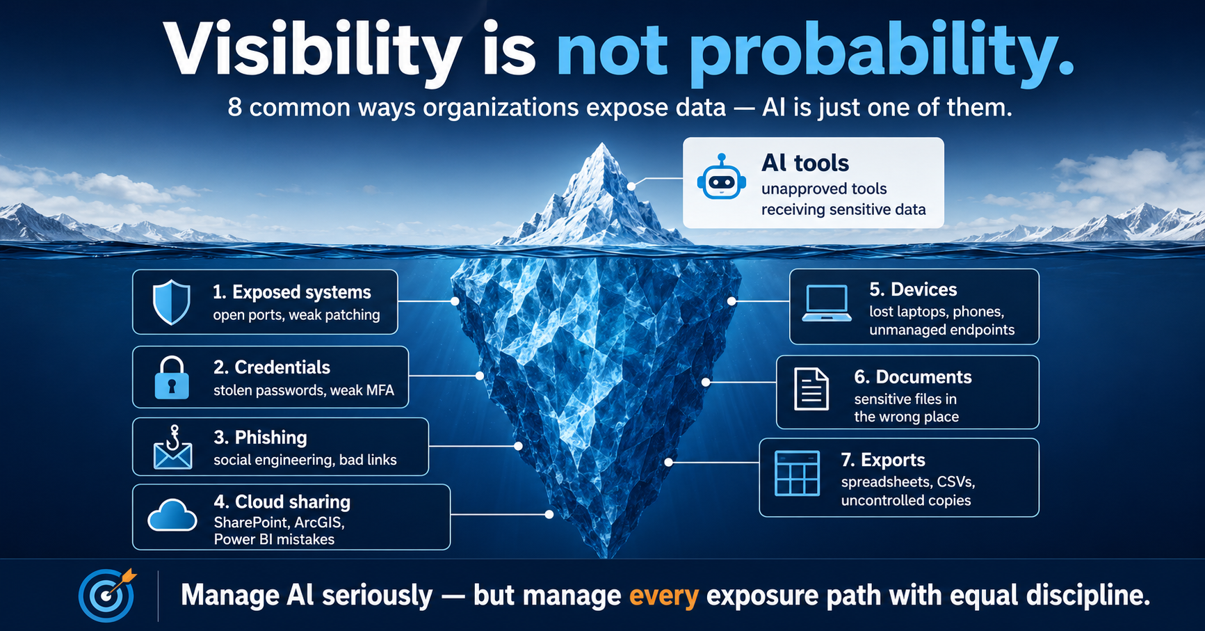
Kahneman's availability heuristic: we judge risk by how easily examples come to mind. AI is new, powerful, and constantly discussed, so it feels like the dominant data threat. But credential theft, phishing, mis-shared folders, lost devices, and uncontrolled exports still cause most real-world exposure.
Organizations lose data through eight familiar paths: exposed systems, stolen credentials, phishing, cloud-sharing mistakes, lost devices, misplaced documents, uncontrolled exports, and AI tools. AI belongs on that list as one category, not the whole list. A single compromised password or a mis-shared SharePoint folder can expose more than many AI scenarios.
The framework: fold AI governance into the existing data-exposure program (inventory, classify, set rules, monitor, train, measure) instead of isolating it as a special category that pulls attention from more frequent risks. Neither dismissal nor overcorrection: proportionality.
Source
This tab summarizes a white paper.
A plain-language version of the draft white paper, with the argument kept intact.
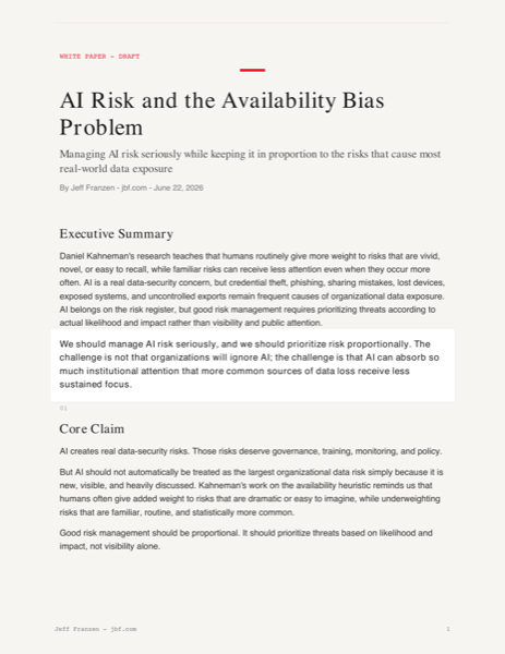
Companion visual for the AI safety paper: the visible AI concern sits above larger recurring data-exposure paths.
Manage AI seriously, but prioritize risk by likelihood and impact — not visibility
Useful anchors
#airisk, #airisk-source
Geo Python
GeoPandas and Matplotlib make static map products.
This is the Python path for maps that need to become PDFs, report pages, executive graphics, atlas pages, and reusable static outputs.
ArcGIS and web maps are best when the user needs to pan, click, filter, and inspect live layers. GeoPandas and Matplotlib are best when the output needs to be repeatable, printable, versionable, and polished as a finished artifact.
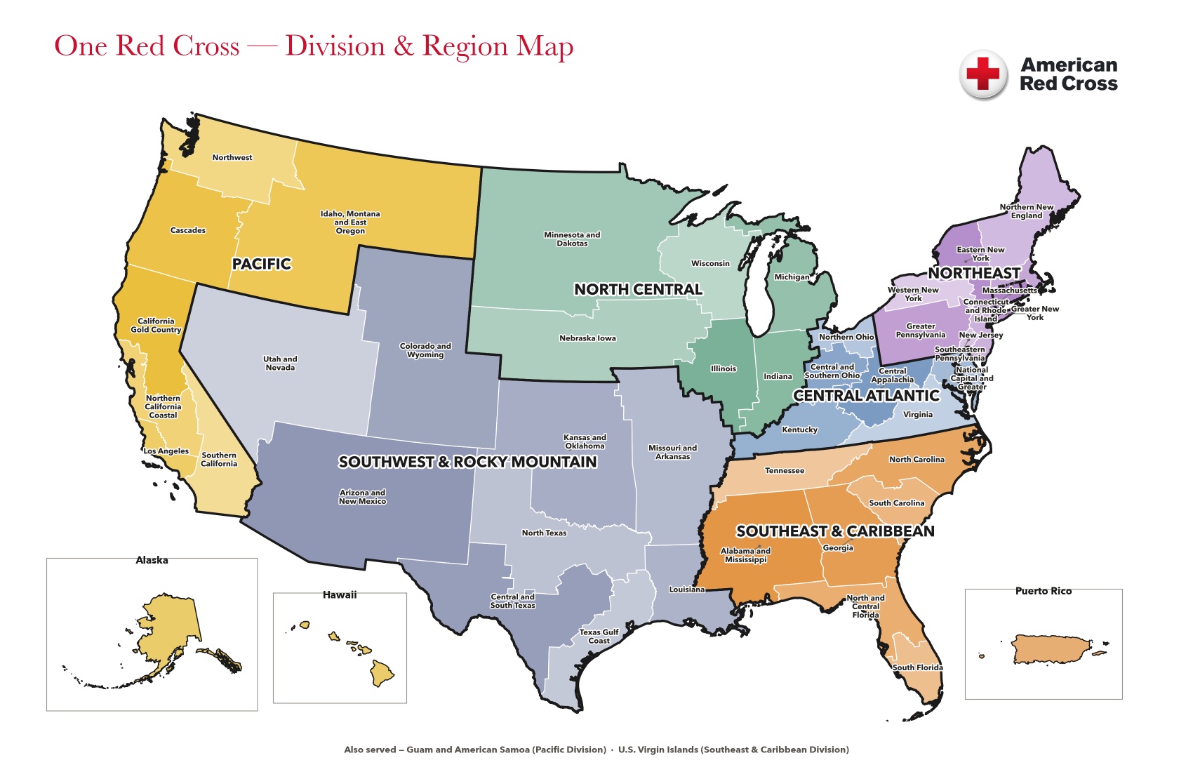
FY27 Division and Region Map from the Desktop/RED CROSS map outputs. It is a good example of Python-built map publishing: boundaries, labels, insets, colors, and export all become code-controlled decisions.
GeoPandasSpatial table work.
Read boundaries, join data, repair projections, dissolve counties into chapters, and calculate what each shape should carry.
MatplotlibMap publishing.
Draw the map, color ramp, labels, legend, title, insets, source text, and page composition.
Why it mattersMaps become reproducible.
The same script can rebuild the output when the source data changes, instead of hand-editing graphics.
1. GeoPandas
GeoPandas treats geography like a spreadsheet with shapes.
A normal pandas table has rows and columns. A GeoPandas table adds a geometry column, so each row can represent a county, chapter, facility, route, point, polygon, or line.
That unlocks the work that shows up again and again in Red Cross projects: joining counties to chapters, dissolving county polygons into chapter boundaries, clipping to a service area, and exporting a clean layer or map-ready table.
The spatial data path
1Read geometry
Load counties, ZIPs, chapters, regions, or facility points from shapefiles, GeoJSON, ArcGIS exports, or CSVs with coordinates.
Plain version: GeoPandas is where the map's truth gets assembled before anything is drawn.
2. Matplotlib map examples
Matplotlib is the print shop for Python maps.
Matplotlib is not only for charts. With GeoPandas, it becomes a controlled map-rendering system: figure size, line weights, color ramps, labels, legends, titles, and source notes can all be scripted.
These examples are the kind of static outputs that are hard to keep consistent by hand but straightforward to regenerate when the code owns the layout.
FY27 Division and Region Map
A national division-and-region product with boundary hierarchy, labels, insets, and Red Cross styling. This is the flagship example from the Desktop FY27 Division outputs.
GeoPandasMatplotlibExecutive map
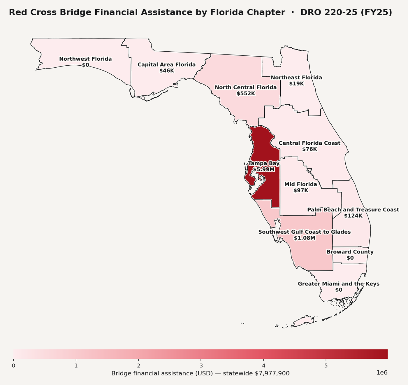
Florida Bridge Assistance by Chapter
Chapter boundaries are dissolved from counties, shaded by value, labeled directly, and exported as a report-ready map.
Chapter dissolveChoroplethLabels
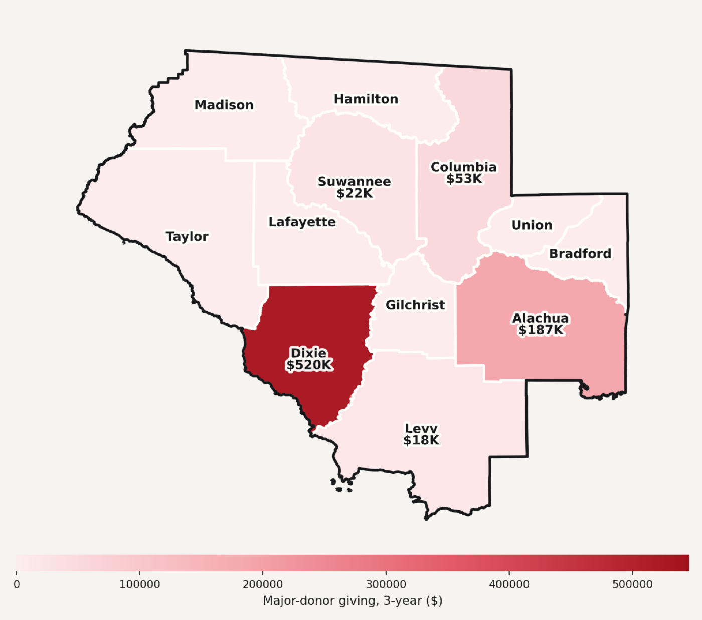
North Central Florida Donor Map
A chapter-scale output from the chapter atlas pipeline: county-level donor values joined to geometry and rendered as a compact page graphic.
chapters.jbf.com outputCounty joinAtlas map
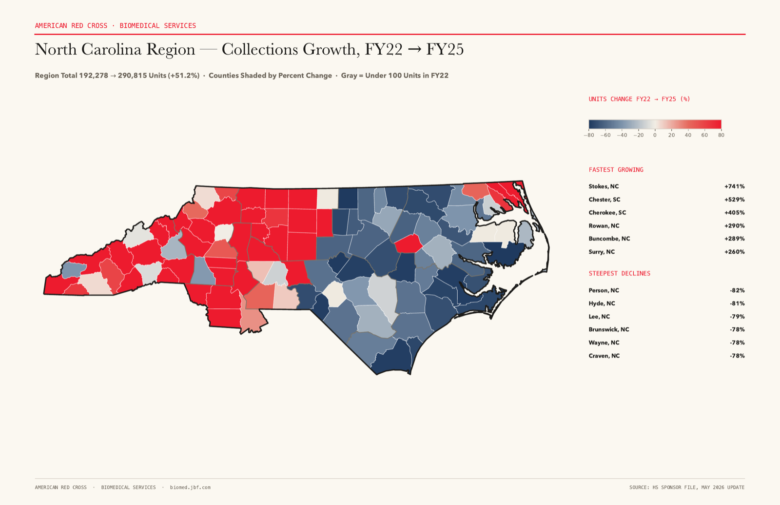
North Carolina BioMed Growth
Page one rendered from the BioMed growth PDF only as a PNG. Counties are shaded by change, with ranked fastest-growing and steepest-decline lists on the side.
BioMedPage-one PNGDiverging ramp
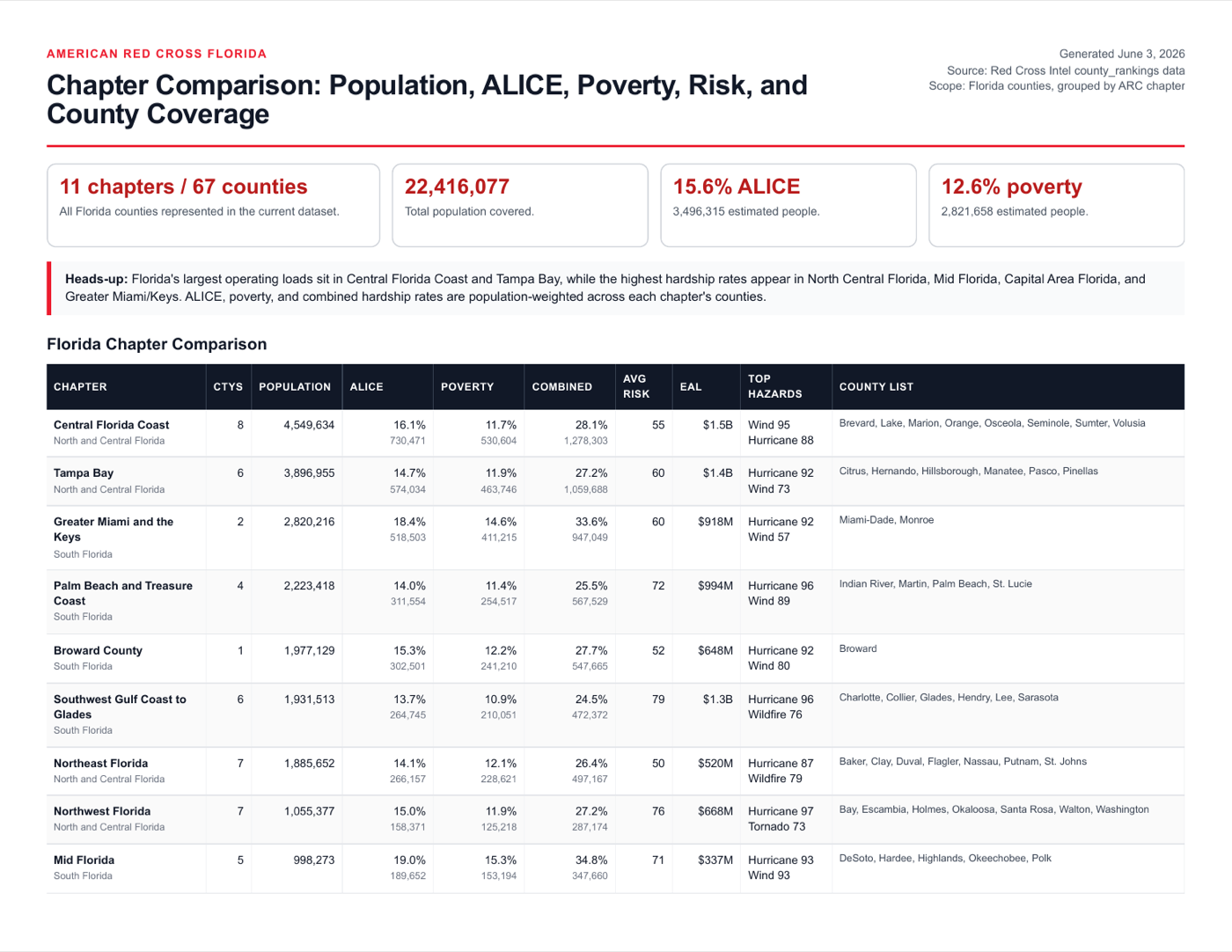
Florida Chapter Comparison Output
A generated chapter-intelligence report preview from the same ecosystem: static, repeatable, and ready to publish alongside maps and atlas pages.
chapters.jbf.com outputReport pageStatic publish
Source
The examples come from existing local work.
The visual examples were pulled from Desktop FY27 Division outputs, the Chapter ED / chapters.jbf.com output family, and the North Carolina BioMed growth map supplied for this update.
GeoPandas code families
project-keystone geo scripts; chapter-ed-platform render and bridge-spending scripts
Matplotlib outputs
FY27 Division map, Florida Bridge map, North Central Florida donor map, BioMed growth map
Start with a result. Change one thing. Read the code.
Twenty-two Python tools, each tied to a disaster-data task you can run, inspect, and copy.
Search by tool or job, open a card, change the input, and run the lesson. The result comes first. The Python is there when you are ready to see how it works.
Input, Python, output.
Pick a tool above or use the lesson below. Every example is small enough to understand and close enough to real work to be worth copying.
Input
Python code
Output
The page runs an instant browser equivalent. The copied snippet is real Python for the named library.
Red Cross Map Composer
Type the map you want. Let code make the map safely.
The embedded app below is the cleaner standalone shell for the Map Composer idea. It shows how a natural-language request should become validated Red Cross geography settings before any map is rendered.
Current truth: this is still a prototype. It parses known examples, locks the request to FIPS, ECODE, RCODE, and DCODE, and shows rendered sample outputs. It does not yet generate a new custom choropleth from an arbitrary text request.
Works nowProcess and spec demo.
Known map requests resolve to validated geography codes and rendered sample outputs.
Not yetNo arbitrary map generation.
The app does not run GeoPandas or produce a brand-new PDF/PNG from free text yet.
Right next stepRenderer repo workflow.
Use the repo to process map requests one by one until the Python renderer is excellent.
A broader library of recent papers, drafts, discussion briefs, strategy notes, and assessment explainers found under Desktop, the WhitePapers folder, RED CROSS, and Personal.
These are packaged directly with the Coding 101 site so they are easy to open, share, and reference from one place.
No papers match that search.
AI, search, and knowledge systems.
Plain-language papers and briefs about AI risk, sanctioned AI capability paths, search as code, and county-intelligence reasoning systems.
AI systemsPDFJuly 2026
How Modern AI Systems Actually Work
A four-page field guide to LLMs, RAG, agents, MCP, memory, tools, deterministic code, guardrails, and the human responsibility around the whole system.
A visual brief on how AI can support Red Cross-style humanitarian work when it is grounded in operational context, governance, and human decision-making.
A technical issue brief covering official June 2026 release changes, community-reported failures, workarounds, current status, and verification checks for live apps.
The visual version makes the same argument as the paper: the visible AI risk is real, but the larger exposure surface includes credentials, phishing, cloud sharing, devices, documents, exports, and exposed systems.
Visibility is not probability: AI is one exposure path, not the whole risk program.Source note
Packaged with the site for direct sharing.
The PDFs, DOCX files, and AI-risk iceberg image are stored as static assets in this site, so the public links continue to work through the normal Vercel deployment.
Published assets
57 paper, brief, and map-report files grouped into AI/search, GIS/operations, chapter/BioMed/field systems, Desktop intake, and a curated LiDAR set.
A monthly digest listed 31 geospatial papers. Most are academic. A few map straight onto disaster work — damage assessment, deployment routing, vulnerability mapping. Instead of just reading them, three of the methods were rebuilt as live browser demos.
This is the everyday agent move: take a paper's method, ignore its specific dataset, and stand up a small interactive version you can actually touch. The demos below run real algorithms on illustrative synthetic data.
BeginnerA paper is a recipe.
The value is the method — how it measures something — not the one map in the figure.
IntermediateRebuild the smallest version.
Betweenness on 70 nodes teaches the same idea as 180 million nodes, and it runs in a browser.
Why it mattersIt makes research operational.
A choke-point map or a vulnerability ranking is a decision tool, not a citation.
The embedded app has its own left-side navigation. Scroll inside the frame to reach Street Networks (betweenness for deployment routing), Change Detection (before/after damage swipe), and Vulnerability Index (weighted community ranking). Every control is live.
Embedded from 31-gis-papers.vercel.appPaper to working tool
2. What each demo shows
Three papers, three decisions.
Each demo answers an operations need, not an academic one.
Method to decision
Street networks · #6Betweenness centrality finds the bridges and arterials every shortest path runs through — the segments a deployment plan must keep open or route around.
Change detection · #8A before/after composite detects, dates, and measures disturbance per cell — the morning-after damage-assessment triage signal.
Vulnerability index · #31Several indicators, weighted and ranked, surface the communities to pre-position for — move the weights and the ranking updates.
Frame it this way: #6 and #8 reproduce against real public data today; #31's source was unverified in the digest. The demos use synthetic data to show the method, not findings.
Source
Where this came from.
A standalone static page (one index.html, no build step) computes real Brandes betweenness, a procedural change-detection grid, and a weighted choropleth in vanilla JavaScript. Coding 101 embeds the live Vercel deployment instead of copying the code in, the same way the State Demo tab works.
Fifteen ways a spatial interface can stop looking like a dashboard.
Most GIS dashboards are the same shape: a map, a fixed sidebar, a grid of static KPI cards. The Spatial Interface Lab is a working test bed for fifteen alternatives — interfaces that react to geography, the calendar, an active event, or what you clicked last — each built as a small live demo against real Red Cross data.
This is the same everyday-agent move as the GIS papers above: take an idea from exploration notes, stand up the smallest working version, and see if it actually changes how someone would use the tool.
BeginnerA dashboard is just a menu.
Buttons, tabs, and cards are all navigation — the map itself can be the menu instead.
IntermediateState drives layout.
Season, an active event, or a saved preference can rearrange what's on screen without a single new menu item.
Why it mattersFewer menus, more findings.
The goal isn't decoration — it's cutting the clicks between someone opening a tool and getting an answer.
The embedded app has its own left-side navigation, starting on Overview. Scroll inside the frame and click any concept — the map becoming a menu, KPIs you can click to filter, a sidebar that reorders itself by what you use. Every control is live against real geography.
Embedded from interfaces.jbf.comFifteen interface concepts
2. What each concept shows
Fifteen patterns, one at a time.
Each concept replaces one static dashboard convention with something that responds to context.
The map becomes the menuClick a county and the tools blossom out of the geography itself — no sidebar hunting.
KPIs become buttonsEvery number is interactive: click to filter, click again to undo. The dashboard turns exploratory instead of instructional.
Seasonal interfacesSummer surfaces hurricane tools; winter surfaces warming shelters. The calendar decides, not a setting.
Event-driven interfacesA hurricane watch quietly moves hurricane tools to the top; cancel it and they recede into the crowd.
The living sidebarTools you use rise, tools you ignore sink. The ranking persists between visits — the app learns you.
Progressive discoveryStart with three things; capabilities unlock as you work, like earning abilities instead of facing forty menu items on day one.
Geography as navigationDivision to region to chapter to county, by clicking — the breadcrumb is the only menu, and it grew out of your path.
Story navigationSituation, Damage, Needs, Response, Recovery — tabs become a narrative and the same map retells itself at each chapter.
Context menus everywhereThe map, the KPI, the legend, the list — every object carries its own tools, so you navigate through data, never to it.
The dashboard breathesA county gently pulses instead of flashing — attention gets guided, not demanded.
Invisible navigationSay the goal and the interface builds the map — almost no menus. The parser is rules today; the pattern is what matters.
Objects become dashboardsClick a county and it becomes its own dashboard — population, coverage, standing versus the state average — not an attribute dump.
Multiple entry pointsMap, search, KPI, list — four doors into the same room, because different people think differently.
The time machineDrag the slider and the dashboard becomes a movie — totals climb and regions light up month by month.
AI as the interfaceEventually there are almost no menus — you simply ask. Scripted intents today; a live-model swap is the next lab.
Frame it this way: none of these are a redesign of one app — they're fifteen answers to the same question: what replaces a static menu when the interface already knows the geography, the date, and what you just clicked?
Source
Where this came from.
A standalone Vite + React app (spatial-interface-lab) implementing fifteen interface concepts from a July 2026 exploration session, each concept its own component with a live demo, real Red Cross geography, and Calcite icons. Coding 101 embeds the live Vercel deployment instead of copying the code in, the same way the GIS Papers and State Demo tabs work.